
 SCROLL TO EXPLORE ↓
Hatfield-Jeffers
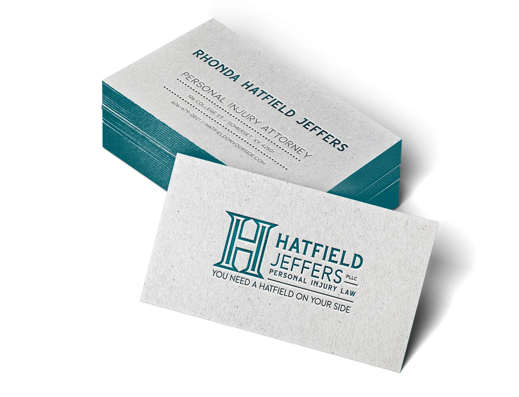
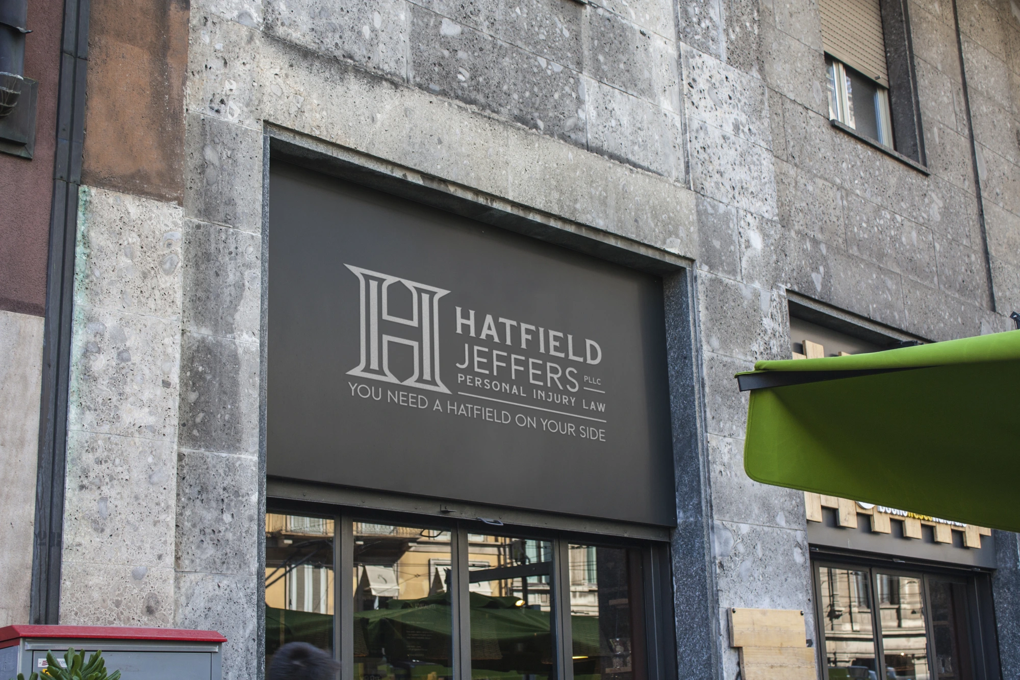
A law practice needs an identity that holds its own—on a building, on a business card and in the details of everyday correspondence. SUPERFAB DIGITAL developed a coordinated identity for Hatfield-Jeffers, connecting a distinctive monogram with practical applications for the practice.
Approved logo artwork, stationery and signage files brought together as a usable identity system.
PROJECT INFO ↓
Overview
The project moved beyond a standalone logo into the materials a legal practice uses to introduce itself and communicate professionally.
A distinctive H monogram anchors the identity, with clear typography and coordinated versions for different spaces and formats. The archive includes approved stationery and signage artwork alongside design presentation mockups.
The value is consistency and readiness: a recognizable identity that can be carried from a sign to printed correspondence without starting over for every application.
Impact
- A coordinated identity across key practice touchpoints
- Approved artwork prepared for print and signage applications
- Consistent logo variants for different formats
Deliverables
Logo Design • Identity Development • Business Cards • Letterhead • Envelopes • Signage Artwork
The challenge
The approach
The project moved beyond a standalone logo into the materials a legal practice uses to introduce itself and communicate professionally. A distinctive H monogram anchors the identity, with clear typography and coordinated versions for different spaces and formats. The archive includes approved stationery and signage artwork alongside design presentation mockups. The value is consistency and readiness: a recognizable identity that can be carried from a sign to printed correspondence without starting over for every application.
Services
Logo Design • Identity Development • Business Cards • Letterhead • Envelopes • Signage Artwork
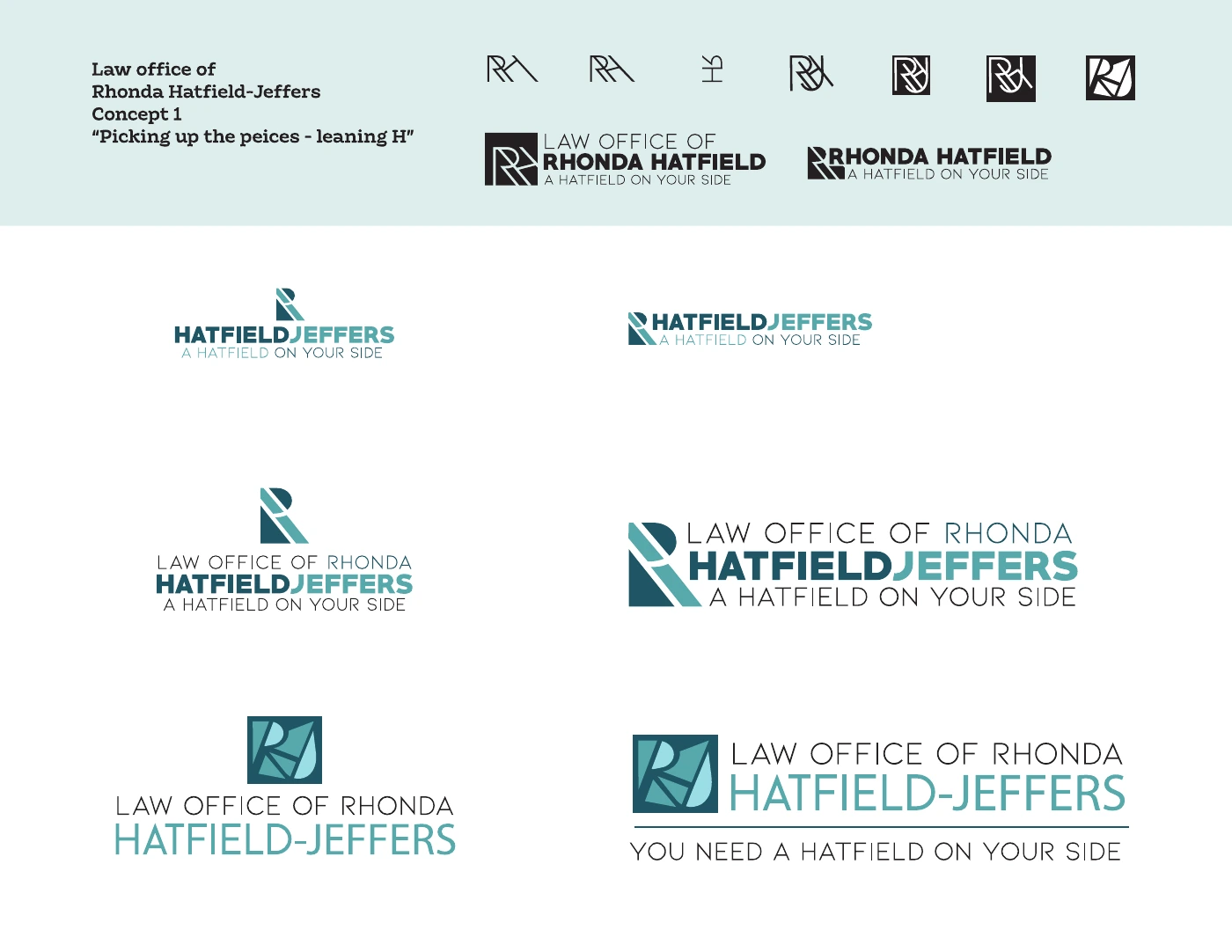
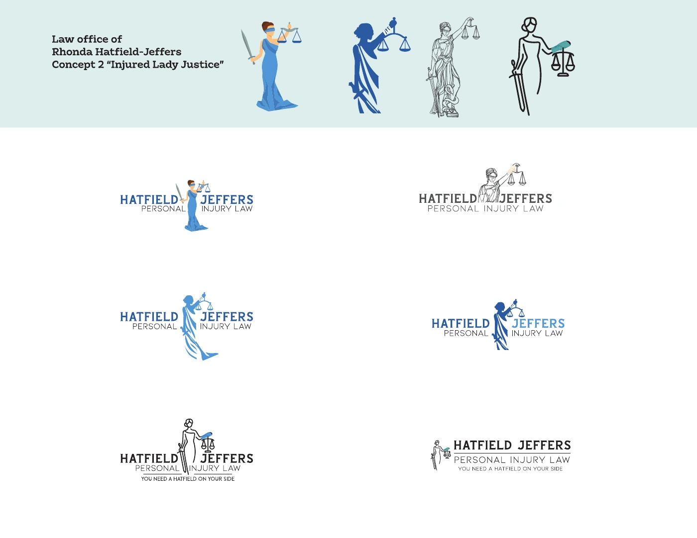
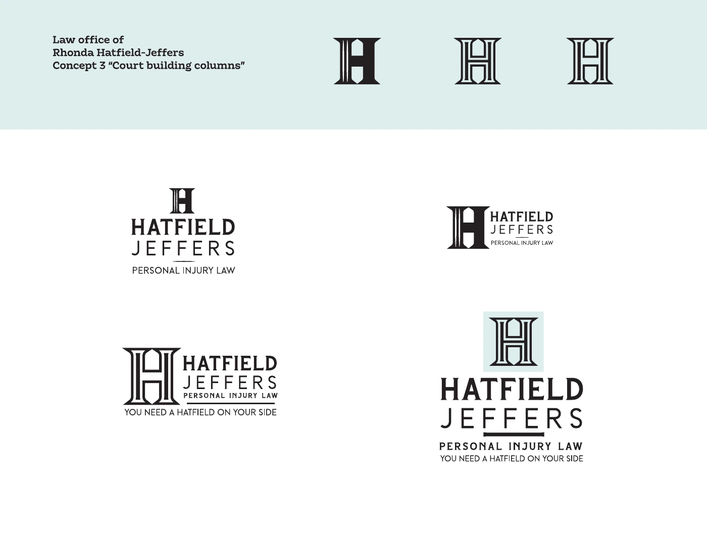
Three directions.
One distinct identity.
The initial presentation explored an abstract monogram, an illustrated Lady Justice and architectural lettering inspired by courthouse columns. These are concept explorations, shown separately from the approved identity.
A few more
distinct personalities.
Different businesses. Different design problems. This supporting collection shows how a distinctive idea can become a recognizable mark—from food and finance to community spaces and hospitality.

What could we
make together?
Let’s talk about your project ↗Back to all projects ↗Identity and application artwork by SUPERFAB DIGITAL. Mockups are design presentations, not installation photographs.