

 SCROLL TO EXPLORE ↓
Lifeline Homecare
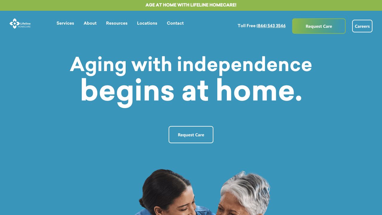
Helping families understand their options takes clear, considerate communication. This work connects Lifeline’s website, printed service information and campaign creative through a consistent visual approach.
A coordinated set of digital, print and campaign materials for a homecare organization serving communities across Kentucky.
PROJECT INFO ↓
Overview
The website organizes services, resources and locations, with distinct routes for people seeking care, veterans and referring professionals. The print work carries that information into a brochure people can keep and share.
The archive contains multiple years of campaign graphics and brochure development, making this a useful example of an ongoing design relationship rather than a single deliverable.
Impact
- Connected service, location and inquiry information through the website
- Carried the visual language into a portable service brochure
- Extended the communication system across recurring campaign artwork
Deliverables
Website Design • Brochure Design • Service Information • Campaign Artwork • Digital Communications
The challenge
The approach
The website organizes services, resources and locations, with distinct routes for people seeking care, veterans and referring professionals. The print work carries that information into a brochure people can keep and share. The archive contains multiple years of campaign graphics and brochure development, making this a useful example of an ongoing design relationship rather than a single deliverable.
Services
Website Design • Brochure Design • Service Information • Campaign Artwork • Digital Communications
Care is personal.
The communication should be, too.
A warm visual language carries from service information and inquiry routes into printed brochures and recurring campaign artwork.
 Explore the live website ↗
A clear story.
On screen and in hand.
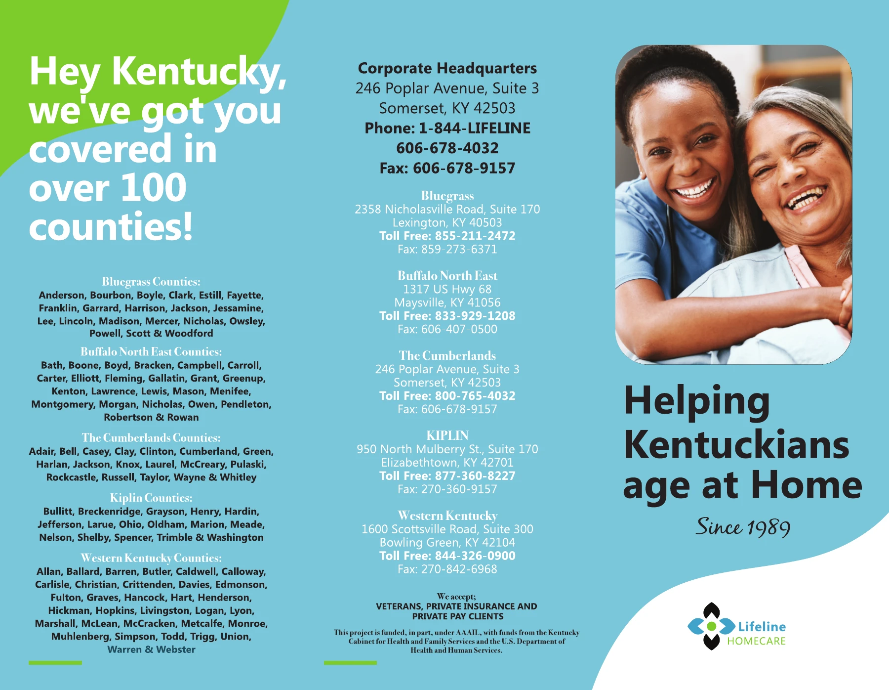
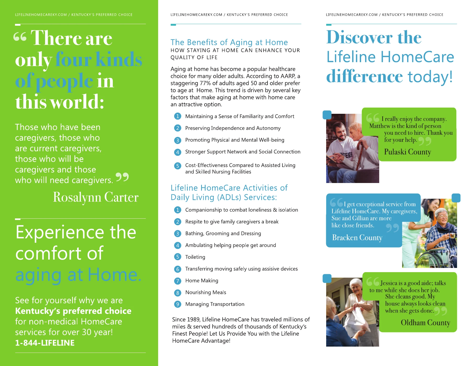
The brochure brings services, regional coverage and contact information into a portable overview. Shown here as archived artwork; addresses and service details may have changed.
More ways
to stay connected.
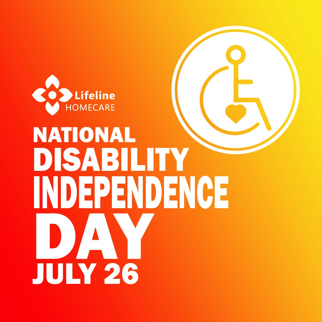
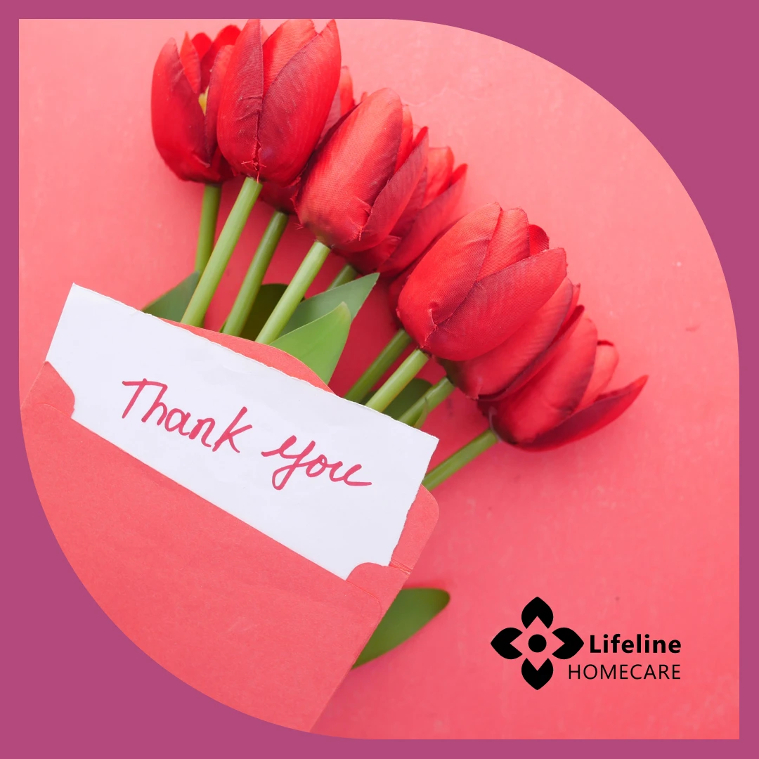
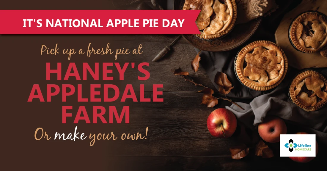
Selected historical campaign artwork shows how the visual language extends across different messages and occasions.

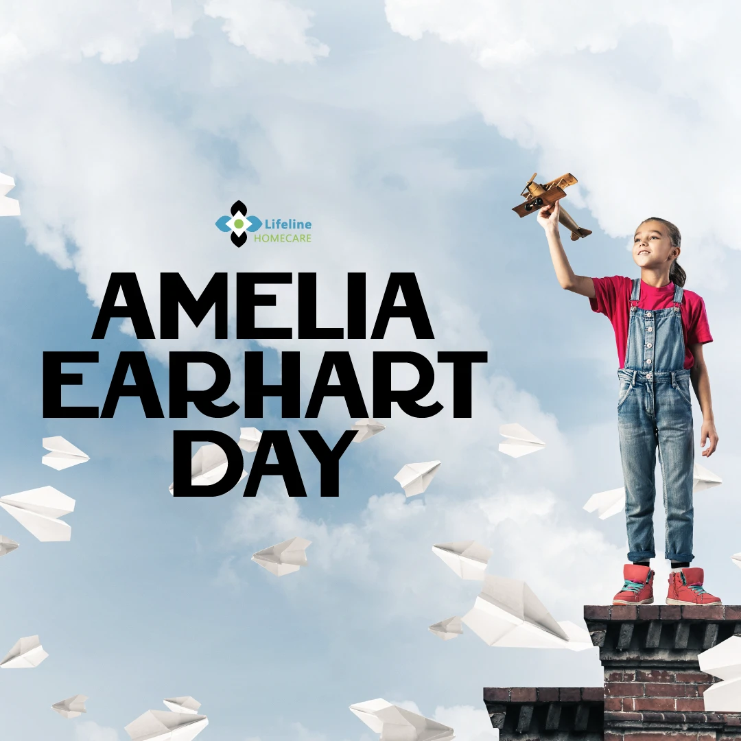


A plan for the month.
A reason for every post.
The archive shows a recurring mix of service messages, recruitment, health awareness, local events and lighter seasonal moments. A shared calendar brought those themes together before the artwork took shape.
Selected entries from the archived Lifeline content calendar, reformatted for this case study. Planning entries do not establish that every post was published.
Same brand.
Different conversations.


What could we
make together?
Let’s talk about your project ↗Next: Lake Cumberland Endodontics ↗Website, brochure and campaign design shown from the SUPERFAB client archive. Existing client identity is presented in context; original logo authorship is not asserted. Cover photograph is a crop from the supplied brochure artwork; photographer credit to confirm.