
 SCROLL TO EXPLORE ↓
Shine House
Where art meets soul. SUPERFAB DIGITAL created a distinctive identity for Shine House—a warm, recognizable mark that connects the organization’s creative personality with its everyday communications.
An identity that Shine House continues to use, supported by practical artwork for print and everyday brand communication.
PROJECT INFO ↓
Overview
Shine House needed a recognizable visual signature with room for its creative personality. The identity connects a heart-shaped symbol with a clear wordmark and the line “Where art meets soul.”
The work extended into business cards, logo versions, letterhead and social guidance. Together, those pieces helped the identity work beyond a single logo presentation. The continued use of the mark is its clearest outcome: a design that has remained part of how Shine House introduces itself.
Impact
- A distinctive visual signature still used by the organization
- Coordinated identity assets for practical print and brand applications
Deliverables
Logo Design • Logo Variants • Business Cards • Letterhead • Social Brand Guidance
The challenge
The approach
Services
Logo Design • Logo Variants • Business Cards • Letterhead • Social Brand Guidance
A creative place.
A mark with heart.
The identity brings the name and the promise together: a heart-shaped symbol, confident lettering and the line “Where art meets soul.” It gives Shine House a recognizable signature across its everyday communications.
Beyond the logo.
Still unmistakably Shine.
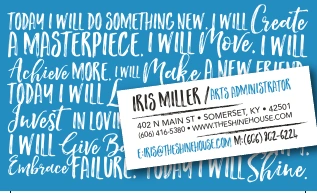
Business cards pair expressive lettering with practical contact information. Logo versions, letterhead and social guidance give the organization a consistent starting point for its communications.
A few more
distinct personalities.
Different businesses. Different design problems. This supporting collection shows how a distinctive idea can become a recognizable mark—from food and finance to community spaces and hospitality.
What could we
make together?
Let’s talk about your project ↗Next: the portfolio ↗Logo and identity artwork by SUPERFAB DIGITAL. Paper treatment is a presentation mockup. Archived contact details are shown as originally designed.